Simplifying Navigation to Improve User Experience
Company: Questrade
Role: Lead UX Researcher
Tools: UserTesting.com, Optimal Workshop, Google Sheets
Duration: 2 weeks
Team: Junior UX Researcher
Stakeholders: Senior UX Designer, Content Designer
The Challenge
Questrade's platform had ongoing usability challenges, particularly around navigation. Users were struggling to manage their accounts,often confused by the navigation labels and organization. The product team needed to understand whether unclear labels were a root cause of user confusion and frustration.
The Goal
Our goal was to evaluate user comprehension of the existing navigation structure and provide actionable insights to improve the clarity of labels and reduce navigation errors.
My Role
As the Lead UX Researcher, I led the design, execution, and analysis of the research. I focused on ensuring the research methodology was sound, the data collected was actionable, and that our findings could lead directly to product improvements.
The Process
Stakeholder Engagement & Research Framing
Initial discussions with stakeholders revealed label confusion as a known but untested issue. I framed the research to explore users' mental models and how navigation supported or hindered them.
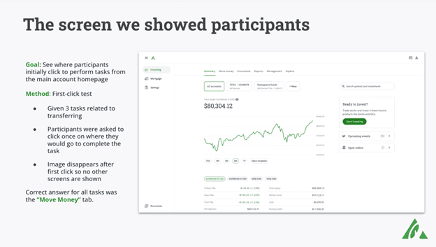
Method Selection: First-Click Testing
I chose unmoderated first-click testing to quickly gather scalable insights into users’ navigation expectations. This method balanced thorough data collection with cost and time efficiency.
Participant Recruitment
I recruited 40 participants, evenly split between existing and new Questrade users, to compare experienced users’ workarounds with new users’ onboarding struggles.
Bias Mitigation
To prevent order bias, I randomized task presentation and limited repetition, ensuring unbiased navigation data.
Data Synthesis & Recommendations
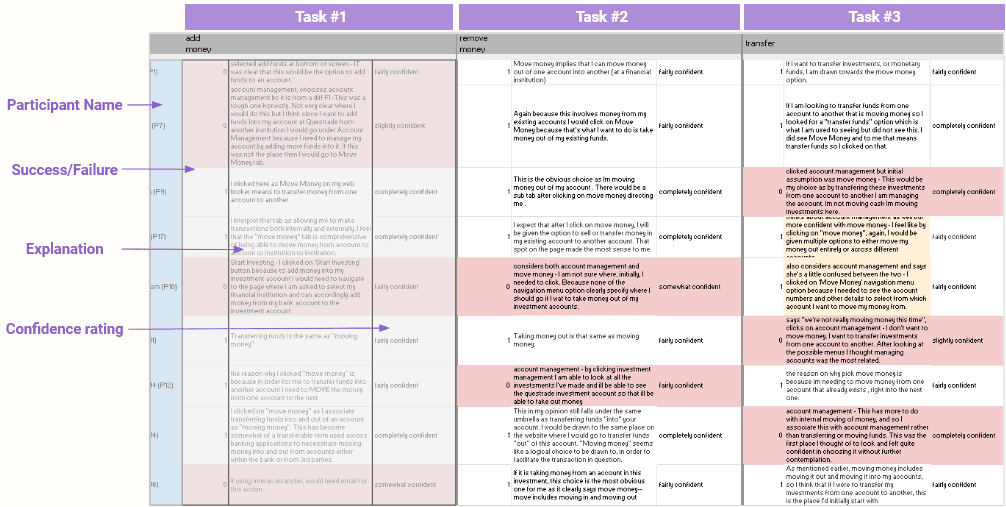
Analyzing navigation errors, I found confusion between “Account Management” and “Move Money.” I recommended clearer labeling and collaborated with the content designer to align new labels with user expectations while maintaining consistency.
Insights & Analysis
Transferring Investments
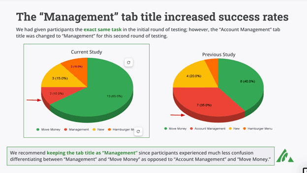
The majority of users incorrectly selected the “Account Management” tab when attempting to move money. This confusion pointed to an overlap in terminology between account management and financial transactions. The data strongly supported the need for a clearer distinction between these sections.
Recommendation
I recommended renaming the “Account Management” tab to better reflect its purpose and prevent overlap with transactional tasks. We also tested a few alternate labels to find the one that resonated most with users.


