Driving Conversion with Concept Testing
Company: Questrade
Role: UX Researcher
Tools: UserTesting.com, Miro
Duration: 3 weeks
Team: Sr. UX Researcher
Stakeholders: Product Manager, UX Designer

Problem Statement & Goal
Questrade aimed to improve conversion rates in their point-of-sale (POS) flow, but there was uncertainty around which features would increase user trust and encourage decision-making confidence. The product team had hypotheses but needed insights on how users would react to these proposed features.
Key Research Questions:
Which POS features build trust and improve conversion rates?
Do transparency elements impact purchase confidence?
How do uncertainty and missing information affect decision-making?
Research Questions
Which POS features build trust and improve conversion rates?
Do transparency elements impact purchase confidence?
How do uncertainty and missing information affect decision-making?

Timeline of research study from initial screener write-up to stakeholder share-out.
My Role
As an assisting UX Researcher, my focus was on conducting research in close collaboration with the Senior UX Researcher and Product Manager. I led usability sessions, gathered insights, and played a key role in synthesizing and interpreting data.
Research Approach
To evaluate how users interact with the POS flow, I conducted:
Stakeholder Alignment
Defined five key hypotheses based on prior user behavior and business goals, focusing on trust-building elements.
Participant Recruitment
Selected 8 participants (ages 25-55) who were actively shopping for similar financial products online.
Moderated Usability Testing
Led sessions to observe decision-making behaviors and validate or challenge our initial hypotheses.

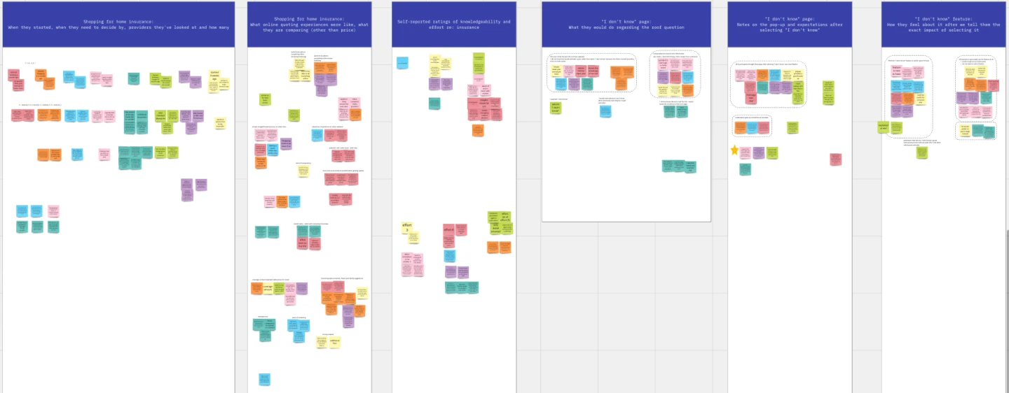
Affinity mapping organizing user feedback for different areas of the POS flow tested.
Analysis & Insights
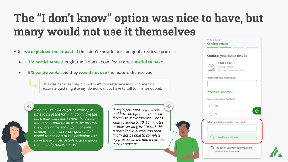
Finding #1: "I Don't Know" Checkbox Created False Data
Before: The checkbox was designed to help users proceed without making uninformed choices.
After Testing: Users preferred to input their best estimate instead of selecting "I don't know," leading to inaccurate survey data.
Decision & Impact:
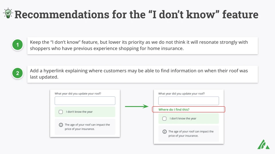
Deprioritized this feature, recommended a hyperlink instead explaining where users could find the information needed.
Finding #2: Transparency in Coverage Increased Trust
Before: The “What’s Not Included in Coverage” section was an optional, collapsible detail.
After Testing: Users strongly favored transparency, with most saying it increased their trust in the product.
Decision & Impact:
Emphasized this section in the final design, making it always visible instead of hidden.
Increased trust scores by 29%, leading to a higher likelihood of users completing the purchase flow.
Slide presented to stakeholders summarizing user testing results on "I Don't Know" feature.
Slide recommending addition of informational hyperlink to form.


